
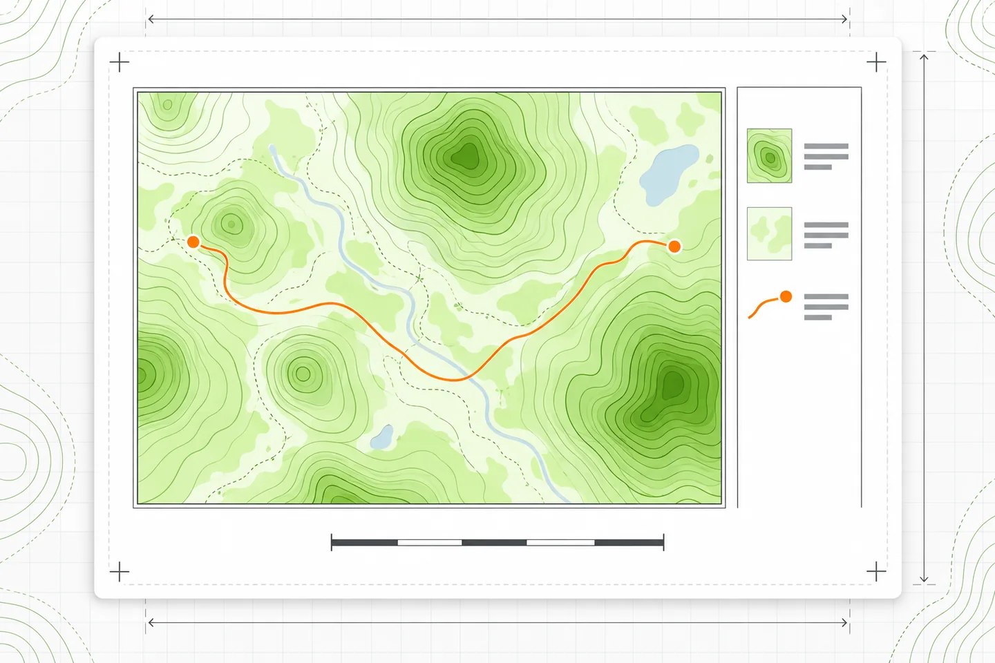
A map that looks clear in the QGIS canvas can become crowded or faint on paper. Print Layout gives you a page, a map frame, and separate controls for the legend and scale bar. The useful habit is to set the intended paper size first, choose what the map must show, and then inspect the exported PDF at the size people will actually use it. This QGIS print layout guide follows that production sequence.
Set the page before placing the map
Prepare the layers and their symbols in the main QGIS window, then choose Project → New Print Layout and name the layout. Set the page size and orientation in the page properties before arranging items. QGIS supports preset and custom page dimensions; the page can be changed later, but a late change may force you to reconsider the map frame, legend space, and readable type sizes. The QGIS Print Layout overview describes page properties and the basic sequence for adding layout items.
Choose dimensions for the final use, not for the size of your monitor. An A4 landscape page intended for an office printer has a different usable area from a larger sheet destined for a print service. Leave room around the page for a title, legend, scale bar, and printer margins. If those items have to cover important geography, the map frame is probably too large or the page too small.
Use Add Map to draw the map frame. A new map item initially takes its view and visible layers from the main canvas, so treat that first view as a starting point. Select the map and use Item Properties to set its scale and review its extent. The map item has its own scale, coordinate reference system, layer controls, and extent controls; you can also move the content inside its frame without moving the frame itself. These distinctions matter when a map must fit a precise area on the page. See the QGIS map-item reference for the relevant controls.
Choose the extent and scale deliberately
Decide which area the reader needs to see, including enough surrounding geography to understand boundaries and routes. Then choose a scale that makes the features and labels legible. Set that scale in the map item and pan the content until the desired area sits well within the frame. Recheck the outer edges: a place name or important feature that almost touches the border may be cropped in the final PDF.
Page size, map-frame size, extent, and scale are connected. At a given scale, a wider frame shows more ground. At a given frame size, zooming out shows more ground but makes every feature smaller on the page. You cannot hold the page and map frame, geographic extent, and scale fixed while changing one of them. If the requested area grows, you must use a smaller map scale, enlarge the map frame or page, or reduce the area shown.
For a simple example in a projected coordinate system measured in metres, a map frame 225 mm wide at 1:100,000 spans about 22.5 km horizontally: 225 mm on paper represents 22,500,000 mm on the ground. That relationship explains the tradeoff, but it does not replace checking the actual layout. A differently shaped extent may need extra space on one side, and a rotated map needs particular care at its corners. Record the chosen scale and inspect the displayed boundaries after every change to the frame or page.
Keep the map’s layer set stable while finishing the layout. By default, changes to visibility or styling in the main QGIS window can affect the map item. If this PDF needs a specific selection, use the map item’s layer controls or a map theme, then verify that the legend reflects the same map. The map-item documentation explains the difference between following a theme and locking the layers shown.
Make the legend earn its space
Add a legend and link it to the intended map item, particularly if the layout contains more than one map. Start by asking what a reader cannot infer from the map alone. Remove layers that serve only as background or analysis inputs, and keep entries for symbols whose meanings need explaining. A short, accurate legend is easier to scan than an unedited list of project layers.
In the legend’s Item Properties, turn off Auto update when you need to reorder entries, remove irrelevant ones, or edit their labels. Replace filenames and internal layer names with reader-facing terms. Check each symbol class as well as each layer heading: a cleaned heading above cryptic class labels is still a cryptic legend. QGIS also offers a filter for items visible in linked maps, which can help keep the legend aligned with the displayed area. These options are described in the QGIS legend-item reference.
After editing, inspect the legend at its final width. Long names may wrap; a fixed-size legend can crop content that no longer fits. Make room or shorten the wording without changing its meaning. If you later change symbology or the map’s visible layers, review the legend again. Manual control gives you a cleaner result, but it also makes that final comparison part of the job.
Add a scale bar and check its units
Add a scale bar, then confirm that it is linked to the correct map item. Set a length and number of segments that a reader can understand at a glance. A bar with many tiny divisions is hard to use in print. Place it where it has a clear background and does not obscure labels or key features.
Check the displayed units rather than assuming the default is suitable. QGIS lets you choose scale-bar units such as metres, kilometres, feet, or miles, and provides a unit-label multiplier. If the bar’s underlying units are metres but its labels are in kilometres, the multiplier and the printed unit label must agree. The QGIS scale-bar reference explains these controls. Recheck the bar after changing the map scale: its link should update the measurement, but its physical length and labels may no longer suit the page.
Export the PDF, then inspect the file
Choose Layout → Export as PDF, select the destination and filename, and review the PDF export options. QGIS allows export settings to be adjusted, including resolution and rendering choices. Some effects require rasterization to preserve their appearance; forcing vector output can produce a PDF that differs from the layout preview. Use the setting that gives the required appearance, then inspect the result rather than assuming either choice is universally better. The QGIS output documentation describes PDF export and these rendering options.
Open the exported PDF in a separate viewer. Confirm its page dimensions, then view or print it at the intended physical size, with “fit to page” scaling disabled for a print proof. Read the smallest place names and legend entries. Inspect thin roads, boundaries, and scale-bar strokes: lines that look distinct at high screen zoom may disappear on paper, while heavy lines may merge. Check the map edges, legend, title, and units for clipping.
Zoom in on raster imagery or shaded relief to look for softness, blockiness, or seams, but judge its suitability at the intended print size as well. A higher export resolution can help when the PDF contains rasterized content; it cannot add detail absent from the source raster. If you alter the export resolution or rendering mode, export a new PDF and inspect that file again. The deliverable is the PDF a reader receives, not the layout preview.